ASUS PQ321Q UltraHD Monitor Review: Living with a 31.5-inch 4K Desktop Display
by Chris Heinonen on July 23, 2013 9:01 AM ESTGiven the lofty price tag, there is a good chance the ASUS PQ321Q is targeting graphics and print professionals, so meeting the sRGB standards of 80 cd/m2 and its custom gamma curve will be important.
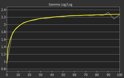
Looking at the grayscale first, sRGB is just as good as our 200 cd/m2 target is. The gamma is virtually perfect, and there is no color shift at all. The contrast ratio falls to 667:1, which I expected as the lower light output leaves less room for adjustments. Graded just on grayscale and gamma, the PQ321Q would be perfect.


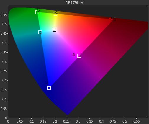
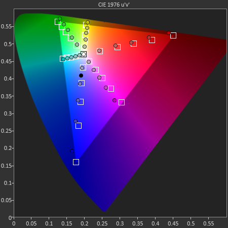
As soon as we get to the gamut, we see the same issues here as I expected to. That gamut is just a little off which gives us some noticeable dE2000 errors at 100% saturations for all colors.

Here with the color checker charts, we see a large difference between the Gretag Macbeth results and the 96-sample results. The error rises from 1.62 to 2.05 as we are sampling more orange/yellow shades that fall outside of the gamut. Nothing really different than the last calibration, so the same issues apply.


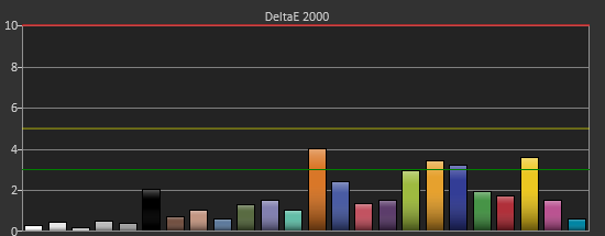

The saturations are also identical to see here. They start out with small errors but by the end, every color except for Cyan is showing a noticeable error at 100%.
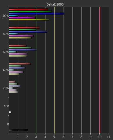
For 200 cd/m2 and a gamma of 2.2 or for 80 cd/m2 and the sRGB gamma, the ASUS PQ321Q performs almost equally. The grayscale and gamma are perfect, but the gamut has some issues. Once we start to see more displays using this same panel, but different electronics and possibly different backlights, then we can determine what is causing this shift in the gamut. With the initial target for the ASUS likely being professional designers, these errors seem a bit out-of-place.


166 Comments
View All Comments
DanNeely - Tuesday, July 23, 2013 - link
As someone who's been in love with his 30" 2560x1600 display for the past 3.5 years the only thing seriously wrong with this display is it's still about twice what I'm willing to spend.Ideally I'd like another inch in the diagonal just to give it the same vertical height as the pair of 20" 1200x1600 screens I'll probably be flanking it with. (I don't have enough desk space to keep the old 30 as a flanker.)
Rick83 - Tuesday, July 23, 2013 - link
I'd prefer if I could avoid the flankers, and just get a screen that is natively wide. 36" 21:9 with 4096 horizontal pixels would be a good start. And going wider wouldn't hurt either, 3:1 - 4:1 h:v ratios should work on most desks.Of course, by then horizontal resolution would reach into the 8k pixels, and display port would have a little cry about required bandwidth, and it would take >1000W of GPU power to render anything halfway complex, at 16MP.... With pixel doubling we're back down to 4MP though, much like a current 30" screen.
I know, pipe dreams, but I just bought new screens, so I can wait another decade or so....I hope people have been buying those 29" 21:9 screens en-masse though, so that manufacturers get it, that there's a market for wide screens, if they have enough vertical pixels.
DanNeely - Tuesday, July 23, 2013 - link
At a 3:1 width (4960/1600), 16" tall, and a normal sitting distance a flat display wouldn't work well. If curved screens ever go mainstream a monolithic display might make sense; until then 3 separate monitors lets me angle the side two so my viewing distance is roughly constant across the entire array.Rick83 - Wednesday, July 24, 2013 - link
For gaming, it has to be flat, until proper multi-head rendering gets implemented. Otherwise the distortion will mess things up.And for films, the central 2.35:1 area should also be flat.
sheh - Tuesday, July 23, 2013 - link
ASUS hinted at 24" hi-DPI monitors in about a year.At the end here: http://www.tomshardware.com/reviews/asus-ama-toms-...
bobbozzo - Tuesday, July 23, 2013 - link
I'm getting farsighted (and can't tolerate reading glasses due to the horrible lighting at work (I know, the should fix it)), and am considering moving to a 27" monitor and putting it further back on my desk to reduce eyestrain.Cataclysm_ZA - Tuesday, July 23, 2013 - link
Chris, can you please test out scaling in Windows 8.1 with the DPI setting on 200% for us? That enables pixel-doubling and that may also make more applications and websites look a lot clearer. If Anand can try out the same thing with his RMBP and Windows 8.1, it would be interesting to see the results.JDG1980 - Tuesday, July 23, 2013 - link
Does 200% DPI on Windows 8.1 actually do nearest-neighbor scaling on legacy applications? The other scaling factors use GPU scaling (probably bilinear or bicubic) if I'm not mistaken, resulting in the fuzzy results described by the reviewer.freedom4556 - Tuesday, July 23, 2013 - link
On Windows 8 vanilla you have a choice between Vista-style (GPU) and XP-style DPI scaling, and the XP method doesn't appear to use the GPU scaling methods described, but only text scales and not images and other non-text UI elements, leading to layout issues in most legacy apps.cheinonen - Wednesday, July 24, 2013 - link
At 200% the poorly scaled text is more readable than before. Things that do scale correctly are incredibly sharp, though I wouldn't keep it here as I miss the desktop space too much. It's certainly better than 150% on those poorly scaled items, but just too large IMO.