ASUS PQ321Q UltraHD Monitor Review: Living with a 31.5-inch 4K Desktop Display
by Chris Heinonen on July 23, 2013 9:01 AM ESTUniformity is tested by using 25 locations across the screen and measuring the color checker chart at each of them. From there we can pull out contrast, black and white uniformity, and color uniformity. This review is the first to utilize the newest measurement available in CalMAN 5.1.2: dE From Center. Now instead of measuring the dE2000 at every location, we measure it relative to the center measurement.
This gives us a true uniformity measure. I could measure the left side and the right side of the monitor and get a dE2000 of 2.0 for each side. What that doesn’t tell me is that the left side might be red tinted, and the right side blue tinted, while the center might be green tinted. In this case they could all measure the same dE2000, but look totally different. By comparing the measured values to the center, we get an actual measurement of if one area of the screen will look the same as another area. Since we always use the center of the screen as our calibration target, which is why everything is measured relative to that.
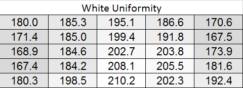
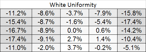
Starting out with White Uniformity, we see decent but not amazing results. The panel stays within +/- 10% for the center, but falls down to a 17% variation at the edges. The light fall-off is relatively high, and makes me wonder if the look of the panel, and its thin design, might place a bit of emphasis on style over substance.
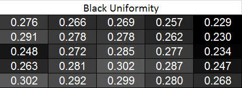
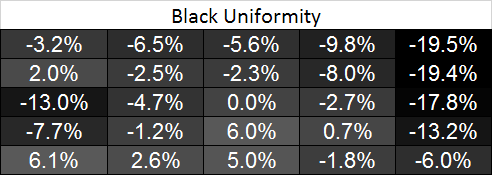
With the black level charts we see similar results. The middle of the panel is +/- 10% again, but the edges fall off to a nearly 20% difference. There is a curious rise in black level in one measure where there was a fall-off in white level, but otherwise the results between the two measurements are similar.
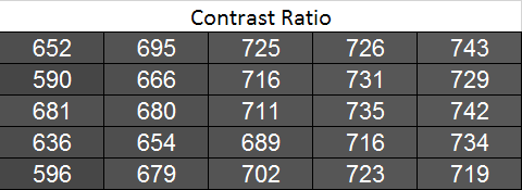
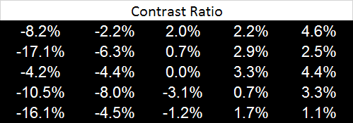
Looking at the resulting contrast, the numbers here are much closer to 100%, which we expect to see. Areas with light fall-off affect the white and black levels almost equally, so the contrast ratios are very similar all across the screen. That gives us a 700:1 expected contrast ratio for the screen as a whole.
Now we can see the new dE2000 From Center data. The issues here crop up at the outsides of the screen, where we see the backlighting issues earlier. Uneven lighting is the issue most likely to cause color issues on the screen, and that is certainly backed up here. In the center of the screen, you are going to not see a difference in colors when you look directly at the screen. With a light loss of less than 10%, and a color dE2000 of <2 for most of the center screen, everything will look identical. As you get to the extreme edges you will run into more issues. I will need more monitors to be tested with this new method, but I think this is going to wind up as a good result in the end.

Going with an LED lighting system, and not a backlit array one, is always a bit of a concern for me. Overall the PQ321Q does well for uniformity for using one, and it avoids some of the massive issues we have seen with some LED systems before. But we are looking for near-perfection from the ASUS and it can’t quite do that. The center 60% of the screen is excellent overall, and for most people that will mean you may not notice these issues at all, but they are there.


166 Comments
View All Comments
DanNeely - Tuesday, July 23, 2013 - link
As someone who's been in love with his 30" 2560x1600 display for the past 3.5 years the only thing seriously wrong with this display is it's still about twice what I'm willing to spend.Ideally I'd like another inch in the diagonal just to give it the same vertical height as the pair of 20" 1200x1600 screens I'll probably be flanking it with. (I don't have enough desk space to keep the old 30 as a flanker.)
Rick83 - Tuesday, July 23, 2013 - link
I'd prefer if I could avoid the flankers, and just get a screen that is natively wide. 36" 21:9 with 4096 horizontal pixels would be a good start. And going wider wouldn't hurt either, 3:1 - 4:1 h:v ratios should work on most desks.Of course, by then horizontal resolution would reach into the 8k pixels, and display port would have a little cry about required bandwidth, and it would take >1000W of GPU power to render anything halfway complex, at 16MP.... With pixel doubling we're back down to 4MP though, much like a current 30" screen.
I know, pipe dreams, but I just bought new screens, so I can wait another decade or so....I hope people have been buying those 29" 21:9 screens en-masse though, so that manufacturers get it, that there's a market for wide screens, if they have enough vertical pixels.
DanNeely - Tuesday, July 23, 2013 - link
At a 3:1 width (4960/1600), 16" tall, and a normal sitting distance a flat display wouldn't work well. If curved screens ever go mainstream a monolithic display might make sense; until then 3 separate monitors lets me angle the side two so my viewing distance is roughly constant across the entire array.Rick83 - Wednesday, July 24, 2013 - link
For gaming, it has to be flat, until proper multi-head rendering gets implemented. Otherwise the distortion will mess things up.And for films, the central 2.35:1 area should also be flat.
sheh - Tuesday, July 23, 2013 - link
ASUS hinted at 24" hi-DPI monitors in about a year.At the end here: http://www.tomshardware.com/reviews/asus-ama-toms-...
bobbozzo - Tuesday, July 23, 2013 - link
I'm getting farsighted (and can't tolerate reading glasses due to the horrible lighting at work (I know, the should fix it)), and am considering moving to a 27" monitor and putting it further back on my desk to reduce eyestrain.Cataclysm_ZA - Tuesday, July 23, 2013 - link
Chris, can you please test out scaling in Windows 8.1 with the DPI setting on 200% for us? That enables pixel-doubling and that may also make more applications and websites look a lot clearer. If Anand can try out the same thing with his RMBP and Windows 8.1, it would be interesting to see the results.JDG1980 - Tuesday, July 23, 2013 - link
Does 200% DPI on Windows 8.1 actually do nearest-neighbor scaling on legacy applications? The other scaling factors use GPU scaling (probably bilinear or bicubic) if I'm not mistaken, resulting in the fuzzy results described by the reviewer.freedom4556 - Tuesday, July 23, 2013 - link
On Windows 8 vanilla you have a choice between Vista-style (GPU) and XP-style DPI scaling, and the XP method doesn't appear to use the GPU scaling methods described, but only text scales and not images and other non-text UI elements, leading to layout issues in most legacy apps.cheinonen - Wednesday, July 24, 2013 - link
At 200% the poorly scaled text is more readable than before. Things that do scale correctly are incredibly sharp, though I wouldn't keep it here as I miss the desktop space too much. It's certainly better than 150% on those poorly scaled items, but just too large IMO.