The Apple iOS 9 Review
by Brandon Chester on September 16, 2015 8:00 AM EST- Posted in
- Smartphones
- Apple
- Mobile
- Tablets
- iOS 9
UI And System Changes
With every major release of iOS Apple makes various changes to the interface. This has been especially true with both major and minor updates that have come after the launch of iOS 7. With Apple redesigning iOS in what is rumored to have been less than a year, there were naturally areas that weren’t polished or didn’t fit in. This section just covers some of the more major visual and functional changes to the various aspects of iOS.
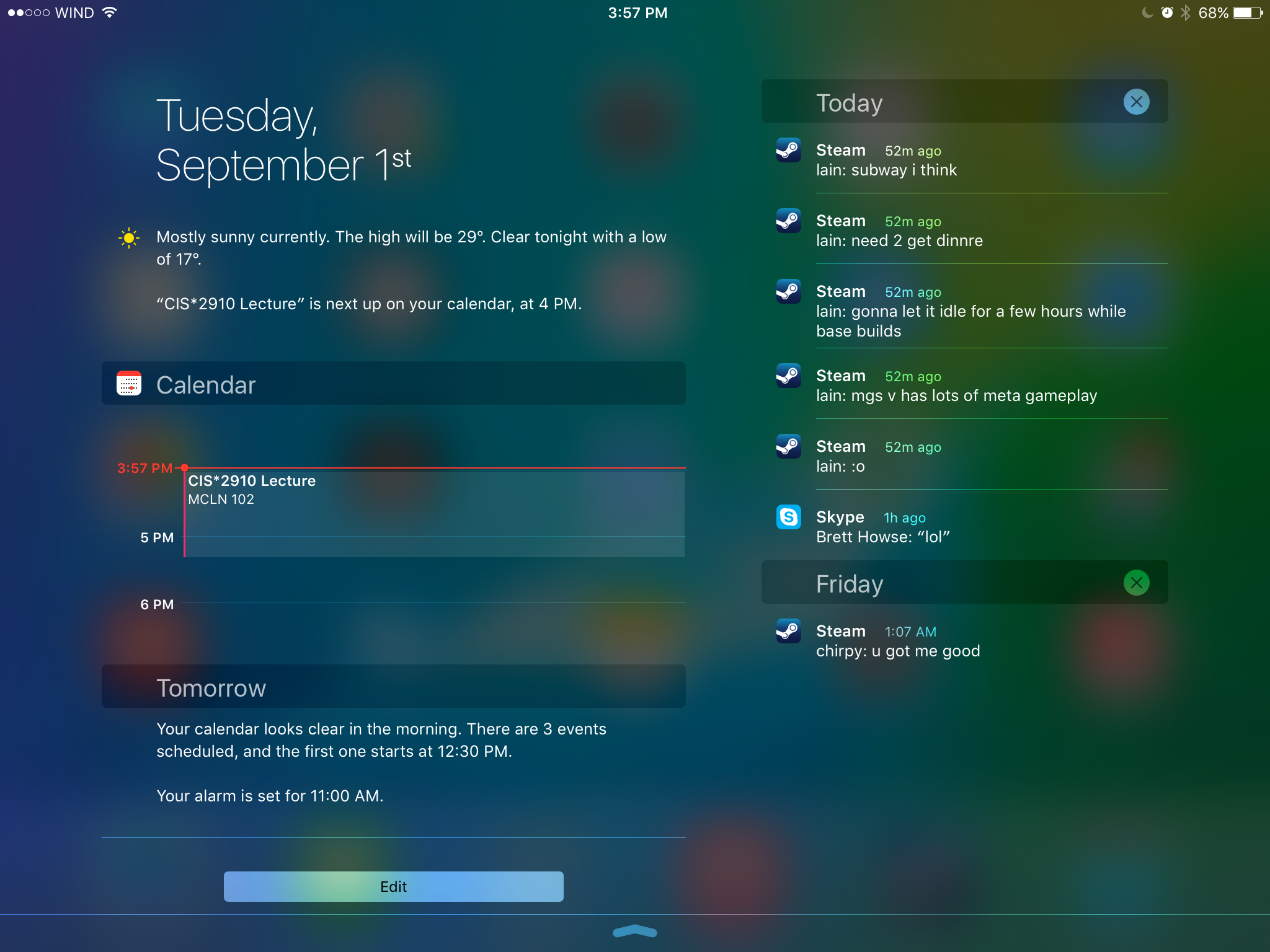
One of the first major changes I noticed in iOS 9 was the new Notification Center layout when in landscape orientation on the iPad. Since there’s enough horizontal space to do so, Apple has segmented the drawer into two sections, with the today view and widgets on the left, and notifications on the right. I’m surprised it took this long for someone to do this, as it has always seemed like an obvious way to use the space in landscape, rather than simply having a bunch of empty space on the sides or stretching the interface to fill the width of the display.
One other thing to note is that notifications now sort by time, and also by date. Previously the notifications still sorted “by time”, but they were also grouped by app. This meant that they didn’t really sort by time in the way you would expect. The group by app feature is now optional, and disabled by default. Notifications are now sorted by when they arrive, and while you still can’t close them all at once, you can delete them by day which ends up being pretty quick. I know the sorting of notifications has been a long source of pain on iOS, particularly among Android users moving to iOS who were used to the sensible time based manner than Android has always used to sort notifications, and it’s good to finally see it changed.

As for the today view, there aren’t many big changes. The one addition that I did notice is a new battery widget, which shows the battery life of devices connected via Bluetooth. This was obviously added with the Apple Watch in mind, but it also applies to other devices like Bluetooth keyboards, speakers, and headsets. It’s important to keep in mind that your Bluetooth device has to report its battery life to the host device in order for this to work. You’ll know if it does if you’ve ever seen a small battery symbol next to the Bluetooth logo in the status bar when your device was connected. For example, I have a Plantronics and a Creative headset here that do show up in the battery widget, but a pair of Sony headphones and an older Creative set that do not.
The recent apps switcher receives a big visual overhaul in iOS 9. Long ago it was a bar at the bottom with app icons, and with iOS 7 it was changed to a list of icons with cards to preview the application. It reminded me a lot of the Windows Phone recent apps list, but it was a much better implementation. This time around it seems that Apple has taken a bit of inspiration from the recent apps tray introduced in Android Lollipop which has a scrolling stack of app preview cards that are overlaid. The iOS recent apps tray is basically the exact same thing, but scrolling sideways instead of forward and back. It works fine, although I don’t know what necessitated the change apart from the old style being really difficult to run smoothly on a device like the iPad due to the requirement of high resolution app previews being entirely loaded into memory.
One consequence of the fact that the recent apps tray now scrolls left initially rather than right is that the direction of the four finger app switching gesture on the iPad is now reversed. I still find myself swiping to the left with four fingers to get my last used app on screen, but this just results in a bouncing overscroll effect as you now need to swipe right with four fingers. I understand Apple’s reasoning, as moving your thumb to the right when holding a phone in your right hand is more ergonomic than moving it left, and this works with the new app switching gesture enabled by 3D Touch on the iPhone 6s, but it does cause a bit of confusion at times if you're used to using that gesture on an iPad.
Something that has been greatly improved about the recent apps list is how you access applications that are being handed off from another device. With the old tray, you accessed it by swiping to the left of the card that had the home screen on it. This meant that if you weren’t at the very beginning of the list you had to scroll all the way back. In iOS 9 you complete the handoff of an application simply by pulling up on a card shown at the bottom of the display. Apple has also used this same interface to show the music app when you have a pair of headphones or a speaker connected via Bluetooth or the 3.5mm jack. I’ve found this very useful when switching from an application to the music app, as it removes the need to go to the home screen to find and select it there.
The last thing I wanted to mention about the new recent apps tray is that the recent contacts list at the top has been removed. I mentioned in my iOS 8 review that it wasn't very useful and that I had never used it, and it looks like I wasn’t the only one who felt that way.
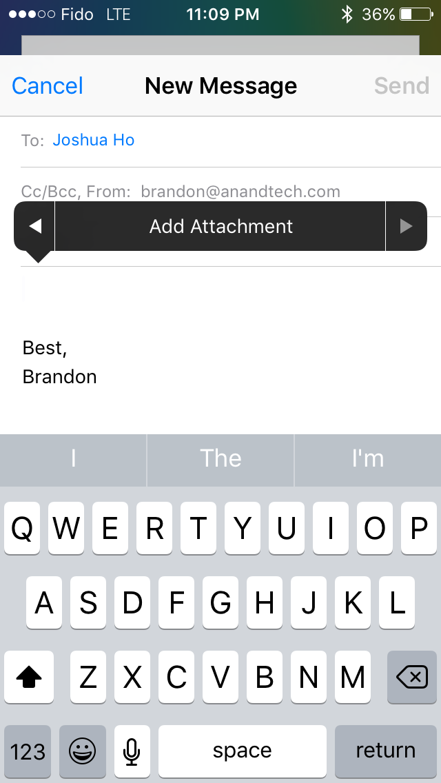
Some of the included iOS apps receive some notable improvements as well. Mail now allows you to include more than five photos in a message which is a long overdue removal of an antiquated constraint. You can also add attachments now, which you select from iCloud Drive. Searching through mail is also much better as well. Previously it would just show you every message that corresponded to the keywords you entered. The search now gives you a list of thread topics that match, and if those aren't sufficient you then have the option to use the older individual message view.
Apple's Photos app gets a couple of upgrades too. There's now a scrubber at the bottom of the iPhone version of the app which allows you to quickly go through photos. The functionality of the scrubber is slightly different from the older version on the iPad, as it accelerates the movement through photos much more quickly. You can also select multiple photos in an easier manner by pressing on one and dragging left or right to select images in a row, and up or down to select an entire row.
There are other visual and functional changes all over the place, and it’s impossible to document them all. A few others that I felt are worth mentioning include a significantly more rounded share and overflow menu with a separated cancel button, 4x4 folders on the iPad, the ability to set your recording resolution to 720p in the settings app in order to reduce the space taken by videos, and the ability to have caller ID guesses made based on emails you’ve received.
Ultimately, there are no revolutionary improvements to the interface among the changes that I’ve highlighted here. The new visual appearance that came with iOS 7 appears to have matured by this point, and now Apple is making refinements to how things look, and improving how things work. I think most of the changes I’ve found and discussed here are for the better, even when they’re removing something like the recent contacts in the multitasking tray. If you’re not a fan of the design of iOS your opinion isn’t likely to change with iOS 9, but if you do enjoy it then you’ll be getting some nice visual and functional improvements throughout the system.
A New System Font
Both OS X and iOS have made some major changes to the system font in recent years. iOS moved from Helvetica to Helvetica Neue on Retina devices in iOS 4, with non-Retina devices moving to the thinner weighted Helvetica Neue alongside the Retina devices in iOS 7. OS X changed from Lucida Grande to Helvetica Neue with OS X Yosemite. This year both operating systems are adopting Apple's San Francisco font. Technically this is different than the San Francisco font used on the Apple Watch, which is a result of the different circumstances and sizes that will be used on an iPhone, iPad, and Mac compared to a smartwatch. Specifically, the San Francisco Compact font used on the Apple Watch has flat edges to letters like e, a, and o have flat edges that put more space between them and other characters to improve legibility.
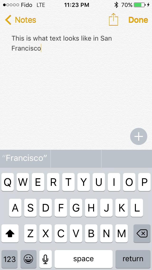

To be honest, I'm not the best person to give commentary on what's good and bad about Apple's new typeface. While I can see and understand the differences between fonts, I find it difficult to articulate exactly what makes a font look and feel different from another similar font. My first impression when using San Francisco was that characters seem more rounded than those in Helvetica Neue, and the spacing between them is greater. After using iOS 9 for quite some time I've grown completely used to them, and the initial surprise of having a different looking font everywhere actually wore off after a couple days. To learn a whole lot more about San Francisco and the process of designing it I would check out Apple's WWDC session that was dedicated to discussing it.


227 Comments
View All Comments
dmunsie - Wednesday, September 16, 2015 - link
The iPhone 5 and iPad 4 could be fine, but the iPad 2 and iPhone 4S probably has more than enough problems that it was easier for them to draw the line with the new ISA rather than burden developers with having to build and test for two different ISAs just to support a couple of devices.greyhulk - Wednesday, September 16, 2015 - link
It's pretty sad that Apple beat Google to the multitasking (split screen) front. In the past, Android tablets were always condidered to be the "power user tablets" and more capable, despite the smaller selection of apps. And they were built with a more ideal aspect ratio for split screen viewing, but only Samsung bothered to utilize it. Google has no excuse for not having built it into stock Android by now.cknobman - Wednesday, September 16, 2015 - link
Apple is trying to copy Windows and the Surface tablet IE "IPad Pro" LOL.A note taking app where you can put in anything for IOS, wow pioneers.
NO OneNote has been doing this for years.
A low power mode when your battery reaches 20%, mind blowing!!
NO Windows phone has been doing this for years with tons of customization options.
dmunsie - Wednesday, September 16, 2015 - link
"A note taking app where you can put in anything for IOS, wow pioneers.NO OneNote has been doing this for years."
Yes, clearly Apple needed inspiration from Microsoft for this since the company that brought you the Newton over 20 years ago (which had even better note taking capabilities) couldn't have come up with this on their own.
jimmy$mitty - Wednesday, September 16, 2015 - link
The Newton was a PDA, not even the first one really just a clone of the others.For tablets, Microsoft had a spec for a Windows tablet PC long before Apple. It was 2002 when the first Tablet PCs started hitting the shelves.
Apple has never truly been original or innovative. Everyone claims Apple had the first GUI, no Xerox did and Xerox gave the idea to Microsoft and Apple.
Apple is just really good at marketing and because their products are so idiot proof and appeal to the not so tech savvy, Look at how easily even toddlers can use an iPhone/iPad, they sell as the masses are not so tech savvy.
Personally I laugh at people. People think the iPod was the first MP3 player, again there were other superior ones like the Creative Zen Blaster (which Creative also sued Apple for the MP3 player GUI and won) or the Sony Walkman.
As said, Apple is just really good at marketing their product which has a big effect, even if they are not superior products. Most people buy products they know and have heard of.
cbmuir - Wednesday, September 16, 2015 - link
Check your facts, Newton was pretty much the first PDA. The British Psion was earlier, but never got much market outside of the UK. Palm, WinCE, etc. came after Newton.The Newton got beat up because of the HW recognition, but after a couple years of development it was pretty darn good.
Swordmaekr - Wednesday, September 16, 2015 - link
The PSion was just a pocket organizer with a chiclet keyboard, no touchpad or any capability for graphical user interface. The Newton was first.Chirpie - Friday, September 25, 2015 - link
Someone seems to make the mistake assuming that making devices for the masses is an easy thing. And it's not nice to laugh at people. It makes a person sound arrogant and unlikeable. :-Pkmmatney - Wednesday, September 16, 2015 - link
Who really cares who came out with an idea first - what matters is how it's implemented.As an iPad4 owner and a Windows tablet owner, I am pretty disappointed with my Windows tablet (running Windows 10). The Windows store is still crappy, and I've had a lot of Apps crash on me. Even solitaire stopped working on my tablet, and the fix was to install VLC player (which re-installed a few things that a Microsoft update removed to kill solitaire!). I've given up an their Apps, too buggy and missing features. The desktop experience isn't bad, but it really does seem like I'm fighting with it all the time just to do simple things. If that was the only tablet I had, I could live with it, but the iPad just does things so much better and smoother. It's my goto device. If I want to do real work, then a laptop is much better,
lilmoe - Wednesday, September 16, 2015 - link
Just curious, which Windows tablet do you have? How much did you pay for it?