Hands-On With the Android N Developer Beta: Multi-Window & More
by Brandon Chester on March 10, 2016 8:00 AM EST- Posted in
- Smartphones
- Android
- Mobile
- Tablets
Additional Features
While Multi-Window mode is arguably the biggest user-facing change to come to Android in a long time, Android N comes with a number of small but highly appreciated changes. The first of these is speeding up the animations throughout the system. Animations like bringing up the keyboard, opening apps, and switching views have been made much quicker without any noticeable loss in fluidity. It makes the entire system feel so much faster, and I think you could argue that UI navigation in Android already felt a bit quicker than iOS or Windows phone to begin with.

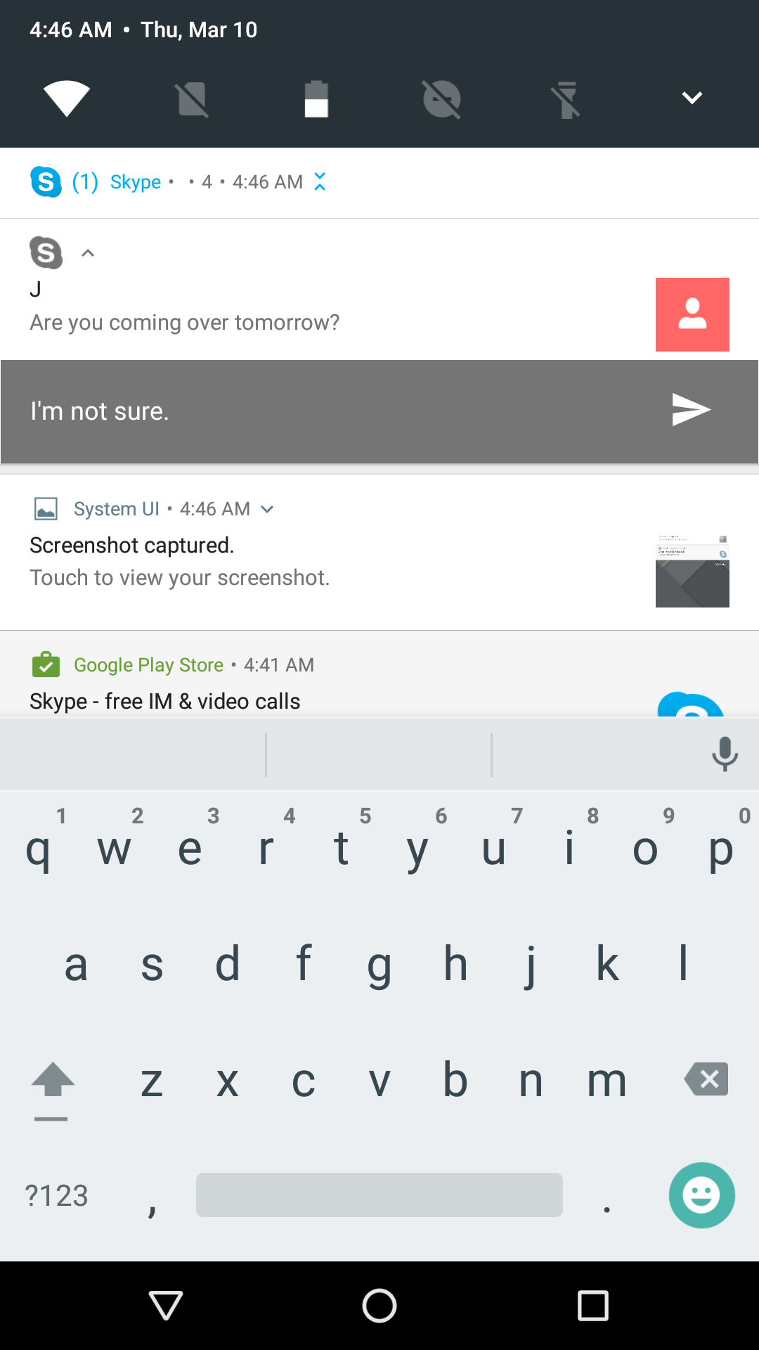
Google has also made some notable changes to the notification drawer. You can now expand and collapse notifications and there's now an API available to bundle many notifications together which is helpful for messaging apps that may end up sending repeated notification payloads to a device. It's a really helpful feature because it avoids the problems of bundling all notifications into one, as well as the problems of displaying a notification for each and every message that arrives. You can even reply to notifications right from the notification shade. I've had mixed results with this. I tried it with Hangouts which is what Google does in their screenshots, but it opened the odd input field that you see in the screenshot on the left above. Skype however worked flawlessly, so it looks like there's some work to be done on the app side and potentially at the OS level to fix some bugs.
In the video above you can see an example of all the new notification related features. Still images really don't do justice to the way the cards expand and contract. It all fits in really well with Google's Material Design aesthetic, and all of the interactions feel very smooth and responsive. You can expand grouped notifications to see a summary of each individual one, and then expand that one even further to view more of the message and get quick access to actions like replying or archiving.
On the topic of the notification shade, there's now official support for editing the quick toggles in the shortcut section. You can also access your first five toggles from the top of the shade, which is a great usability improvement. Like the notification expansion this also has a really great animation. When UI elements take full advantage of Material Design the results are honestly really impressive, and they go a long way in making Android feel much more lively and fluid. The ability to quickly access certain toggles like the flashlight is a great improvement too, as it puts them only a single swipe away instead of the previous model which required you to first swipe to open the notification drawer and then swipe again to get to your shortcuts.
My only complaint about quick toggles is the fact that in the always accessible bar Google continues to just display a battery icon that only gives me a vague idea of what my charge is. If you open the menu you see the percentage, but it hides itself for some unknown reason when you collapse the menu. If you're going let the user always have a battery displayed there you should put a percentage instead of the same inaccurate and frankly useless icon that's in the status bar. Apart from that continued annoyance, the new notification shade features are great improvements. Hopefully this will encourage OEMs to stop messing with the behavior of the notification shade, as Google has basically addressed all required features here and there's not really anything to improve on.
Improving Energy and Memory Usage
With every release of Android Google introduces new APIs, and adjusts existing ones. It's always important for developers to keep up to date with these changes, as they can alter or break existing application behavior, and in general it's good practice to adopt new features relating to reducing memory and energy usage.
With Android N, Google has made some notable changes to Doze and Project Svelte, which are their initiatives to reduce energy and memory usage respectively. If you've already adapted your app for Doze these changes will come automatically, and if you haven't you don't technically need to since Doze manages all apps on Android 6.0 and above, but the new changes may cause issues with notifications and other background work if you haven't adapted your apps.
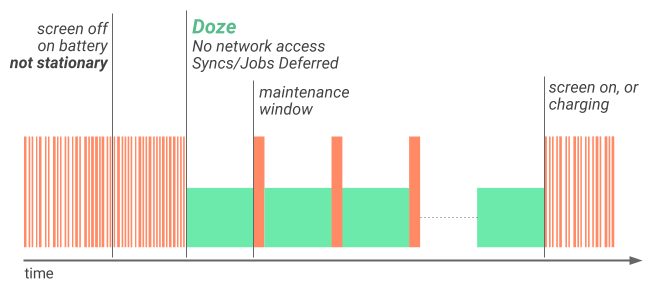
The major change to Doze in Android N is that it also activates even when a phone is not stationary. Previously Doze would activate when three conditions were met. The screen had to be off, it had to be running on battery power, and it had to be stationary. This is still the case for the most aggressive optimizations, which include disabling wakelocks, alarms, GPS, and WiFi, but it's now also the case that the phone will disable network access and defer syncs and background jobs even when the phone is moving. This means that Android devices will now enter this state just by being locked in your pocket. As usual there are maintenance windows where applications can perform background tasks and send or receive data over the network, but the fact that your phone will automatically disable network access and defer background work simply while it's in your pocket will undoubtedly bring gains in battery life.
As for Project Svelte, Google is letting developers know that certain implicit broadcasts are being removed. A broadcast is essentially a message sent by the OS that notifies applications of some change in state, such as a device connecting to WiFi or being removed from a charger. The two broadcasts removed in Android N related to changing from WiFi to cellular networking, and to taking photos and videos. According to Google, many applications wait on these broadcasts and upon receiving them would wake up to process them. Having many background apps waking up at the same time to process a common event like changing from cellular to WiFi presents a real concern for energy and memory usage, and so it makes sense that Google would be removing them.
Other Changes For Developers
Along with some of the more major features that I've talked about so far, there are some changes coming in Android N that developers should look out for and, if necessary, update their apps to accommodate. One that may pose issues for some applications is the new display size setting, which allows users to modify their virtual dpi to make UI elements larger or smaller. Users can't zoom in past a minimum width of 320dp, which is the horizontal space available on a Nexus 4.
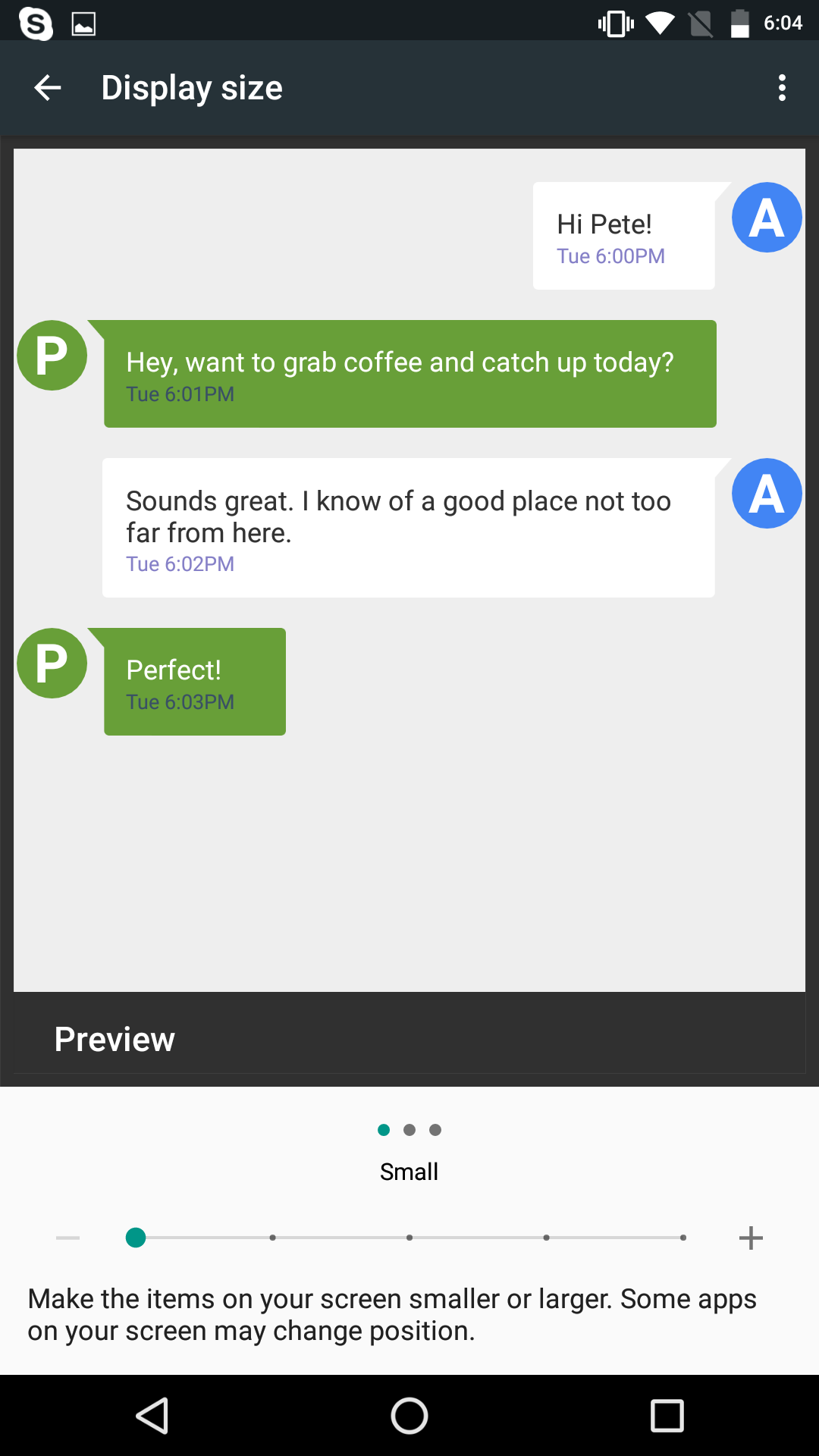

Above you can see the impact of the display size setting. It's definitely an important feature for accessibility, as it goes beyond just making text smaller or larger. I don't suspect that the UI scaling will be a problem for most developers, but if you've been specifying the size of any elements using actual pixel dimensions for some reason it may cause issues. Google's best practices also note that apps will need to ensure that they reload assets such as bitmaps as necessary when the user changes the display zoom setting.
Google has also deprecated one permission and added another in Android N. The GET_ACCOUNTS permission is deprecated, and the OS will ignore apps requesting it that are built targeting Android N. There's also ACTION_OPEN_EXTERNAL_DIRECTORY, which is a new permission that applications can use to create folders for data storage without having to ask for full storage permissions. Keeping with Android's new permission model introduced in Marshmallow, the user will have to explicitly grant permission for this at the time it's requested.
With Android N comes a move to OpenJDK 8 as the Java platform implementation. With that, Google is noting that some behavior has changed, and developers relying on alternative implementations should be aware. Developers will likely be happy to see features like lambda expressions which can simplify much of the code for anonymous inner classes, along with other forms of functional expressions and some of the other features that were added in Java 8.
Finally, Google is reminding developers to stop using private APIs and native libraries that aren't part of the Android NDK. Devices will now put up an error message when this is detected, and I've already encountered Skype causing them on the Pixel C.


124 Comments
View All Comments
5th element - Friday, March 11, 2016 - link
Unless the vast majority of the media you consume is video based.Meteor2 - Saturday, March 12, 2016 - link
I have a TV for that.Alexey291 - Saturday, March 12, 2016 - link
You carry a tv in your bag every day eh? Or sit with it in your lap? Nice niceBurntMyBacon - Monday, March 14, 2016 - link
@Lolimaster: "Sorry but 16:9 is pure sh*t aside from media consumption. 16:10 or even better 3:2 all the way."Or 4:3. I'm not a fan of Apple because of their business practices, but credit where credit is due. I personally like 16:10 for desktops and 3:2 for tablets, but I 4:3 is also pretty good and I'd have no trouble adjusting to it if it meant a superior display. 16:9 is only favorable to me for phones, ... , maybe, ... , I'd have to check out a 16:10 phone to make that judgement for sure and I haven't ever seen one.
ninjaquick - Tuesday, March 15, 2016 - link
Thank God for loli, master. 4:3 is best girl.Alexvrb - Saturday, March 12, 2016 - link
You realize they have apps and such on Win10, as well as a Tablet Mode that's touch and small-display friendly. It ALSO has the capability to do conventional Windows tasks, and usually I only run conventional software when docked or otherwise connected to a larger display via HDMI.ET - Thursday, March 10, 2016 - link
I'm the opposite. I'd much rather use my Galaxy Tab S 8.4 than any Windows tablet. Android offers a better "desktop" and apps and games that run correctly with touch. I own a Windows tablet (with pen) and a Windows phone, and I always go back quickly to Android. I might get an iPad Mini for better games selection and compatibility, but I can't see myself using a Windows mobile device that isn't a laptop.Michael Bay - Thursday, March 10, 2016 - link
>android offers a better "desktop"Nice joke. Duarte sure painted the turd in ranbow colors, but still a turd it is.
raptormissle - Thursday, March 10, 2016 - link
There is nothing worse than the cesspool that is Windows on a tablet. How people can use these old archaic non touch and tablet optimized apps and still say it's a better experience is delusional.Alexey291 - Saturday, March 12, 2016 - link
And then we come to the matter of viruses and malware that windows instantly attracts. Hell comes preinstalled with...