Google Launches New 2014 Google I/O App
by Brandon Chester on June 11, 2014 4:25 PM EST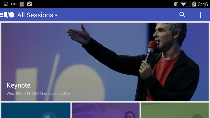
Today Google launched the official mobile app for Google I/O which runs between June 25th and 26th of this year. The app continues Google’s trend of introducing more colors and larger icons into their applications. Between the new visual style and the new methods of navigating the application it is essentially a complete redesign of the application we received for Google I/O 2013.
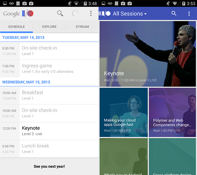
As you can see, the app is much more focused on including color and visuals rather than being a simple list of text with a white background. The main page of the app is a list of the events and sessions that will happen at Google I/O organized in descending order. Each event has a picture with a color filter atop it. The main method of navigating around the app is also changed from the 2013 Google I/O application. Rather than scrolling left and right to navigate between the pages in the app, Google has implemented a menu that slides in from the left and presents the user with a list of all the sections in the app they can navigate to as well as a link to the application settings. This type of app navigation style is becoming increasingly common among Google’s applications as although some may find it causes parts of the application to become hidden away from the user, it allows for more space on each page to be filled with content rather than navigational interface elements. Selecting the dropdown menu on the navigation bar brings up a list of session filters based on theme or topic which can be used to find sessions that best interest the user.

The settings menu accessed from the navigation pane on the left side has some useful options that were not present in the 2013 Google I/O app. Along with the option to only show live-streamed sessions which was present in the 2013 app, the new 2014 app also includes options to automatically sync your selected session schedule with your Google Calendar and to send notifications to your smartphone or tablet when a session you have indicated you want to watch or attend is about to begin. By default, the application also sends anonymous usage statistics to Google to help with app usability and stability improvements.
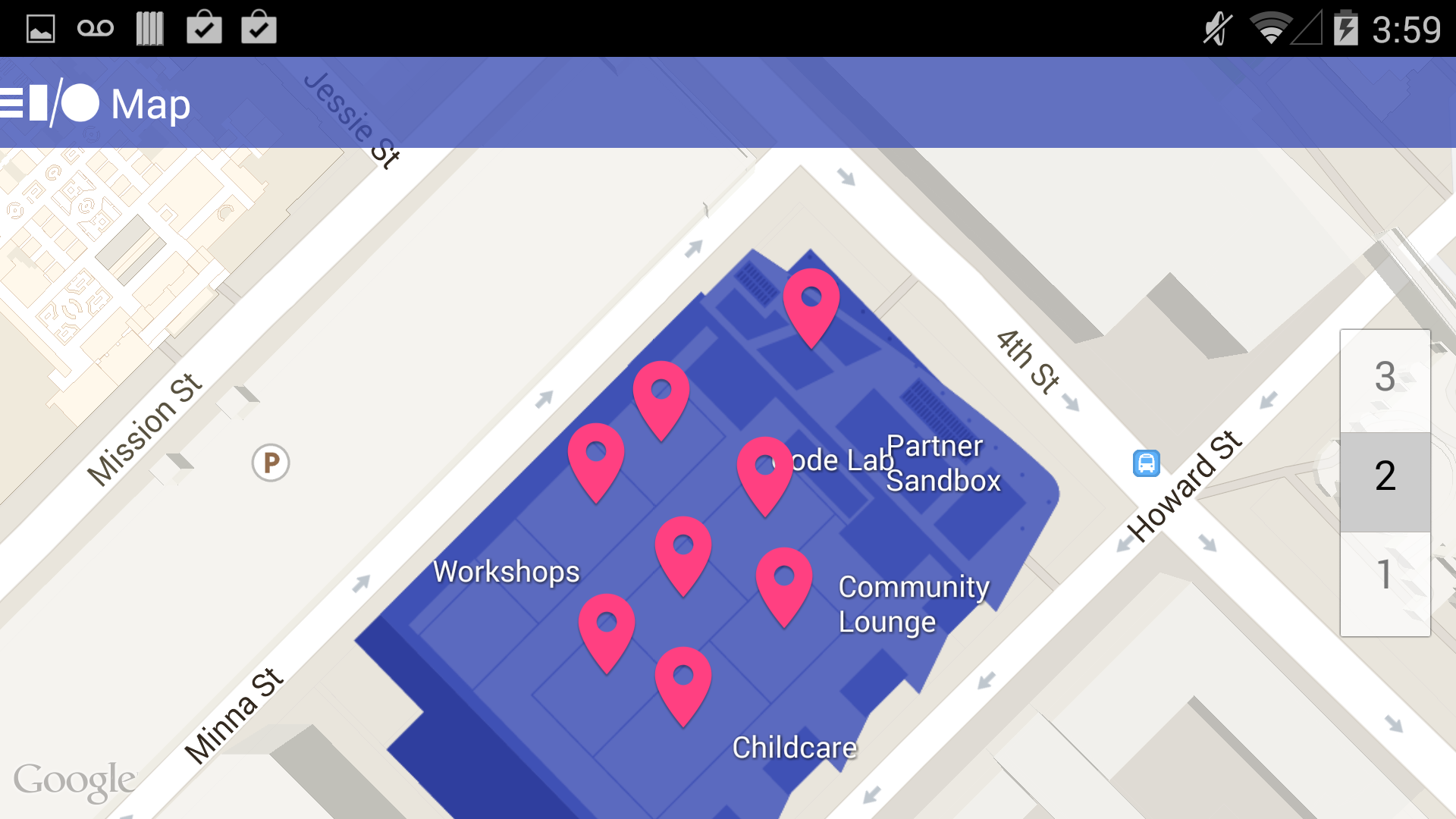
Like always, the three dot overflow menu has a section for displaying a map of the venue which will be held at the Moscone Center in San Francisco again this year. The map view also allows developers to view the event layout on each floor of the building in case they need some assistance figuring out where to go for their sessions. The Google I/O app is rolling out now and can be downloaded from Google Play.
Source: Google Play


5 Comments
View All Comments
ramishxd - Wednesday, November 15, 2017 - link
https://ikmspico10.comhttps://iappvnapk.com
https://ifarsi1hd.com
https://ibarbershopsnearme.com
windows-activator - Monday, May 10, 2021 - link
This is the grate news , it`s time to activate your products here https://windows-activator.net/Dododod - Tuesday, June 15, 2021 - link
Guys, i found a good KMS Pico activator. Try it https://www.kmspicoofficial.com/kmspico-download-o...Dododod - Tuesday, June 15, 2021 - link
Found another KMS Pico activator. Its the best https://kmsauto.org/kmspico/Janise - Wednesday, June 15, 2022 - link
For a long time I could not solve the problem with the activation of my Windows and Microsoft Office, because it's hard to find a free program for activation. After many attempts, I still managed to find a good site where there are all kinds of activators for Windows and Microsoft Office. There are 2 options, one in English https://official-activator.net/ and the other in German https://office-activator.de/